BaseOne if a font that I found while working in my job as Assistant Sports Editor for The Rocket. Since finding this font I have used it many times for The Rocket, both for publication design and for web-based graphics. I use BaseOne mainly as a headline or title font and try to not have too much text at once in BaseOne. I think it works well as a title font because it stands out. This font is sans-serif and exclusively capital letters so it is easy to read when used as a title or headline and BaseOne very much just looks like a sports font. I use this font in a variety of colors and on a variety of backgrounds, even placed on photographs.
This is a graphic I made that was posted to The Rocket's Twitter account. Here I use BaseOne as a title and to show scores. I have the text white with a black stroke on green background and as you can see it is easily readable.
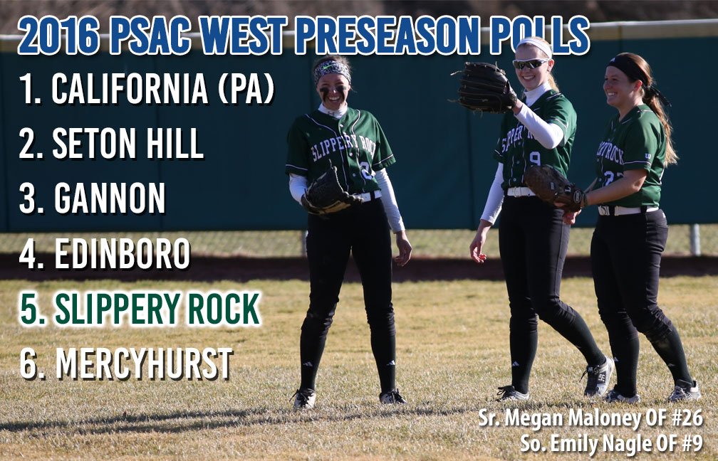
This is another graphic that was posted on Twitter. This time I used BaseOne in three different colors and in three different ways on a photo background. First I used it again as a title font in blue with a white stoke to indicate what the information on this graphic is. Then I use it more as a body font for the list, this time a white color with a black stroke to keep it readable against the photo. Finally, I have the words "Slippery Rock" in green with a white stroke to make it stand out and catch the viewers' eyes.
Examples of how I use BaseOne in p the print publication can be seen every week on page C-2 of every copy of The Rocket. On that page there is a list of team standings for every sports where I use BaseOne again as the title of the list and as a title for each sport.

